Maikhao
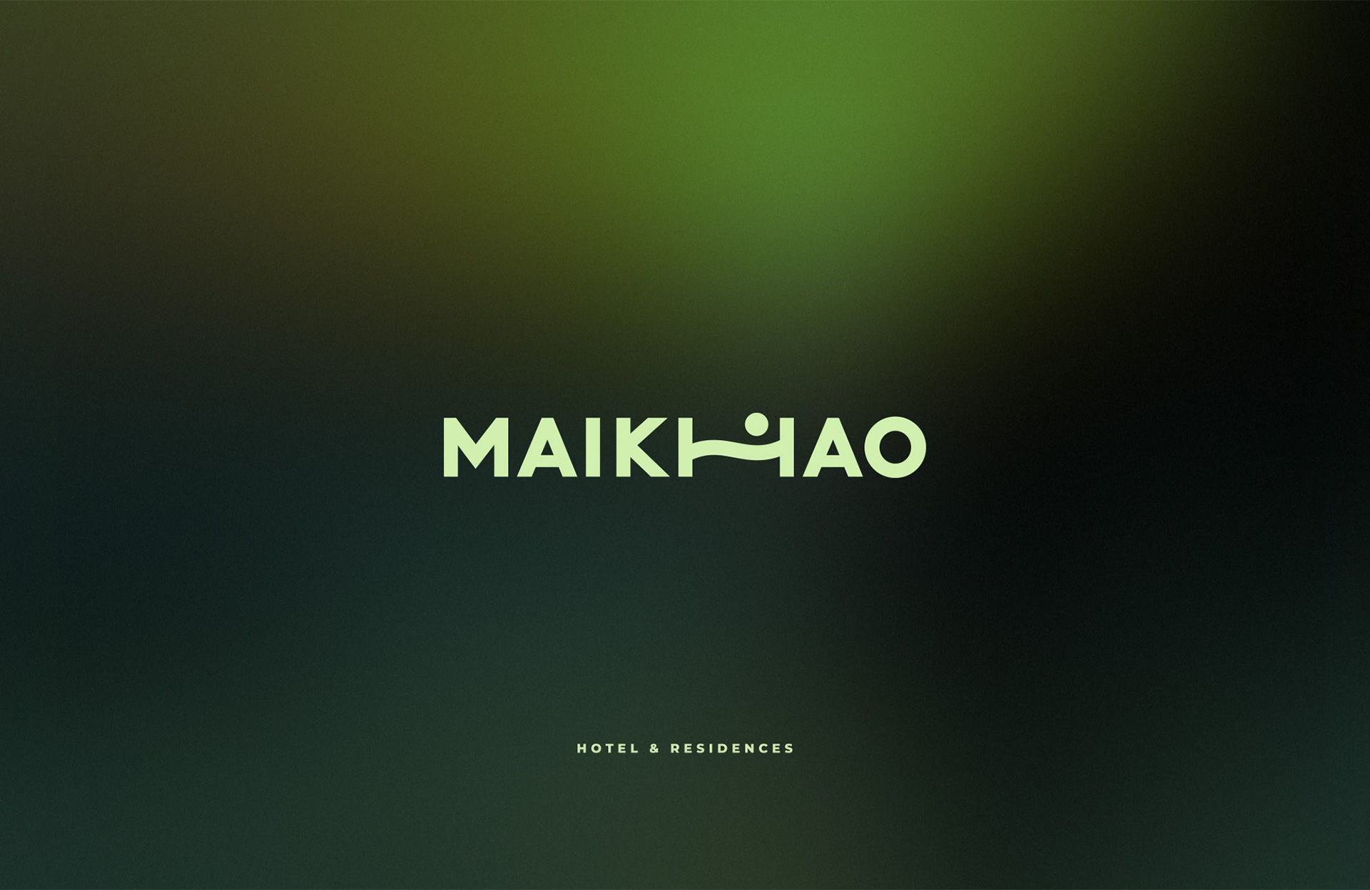
Identity system for a resort and residential complex on Phuket’s Mai Khao beach — shaped around coastal calm, organic wave contours, and architectural clarity.
Built for tropical architecture and guest touchpoints
Maikhao Residences combines modern resort living with untouched coastal nature. The goal was to create a calm, recognizable identity system that feels organic on physical materials, signage, and guest amenities while staying crisp across digital booking channels.
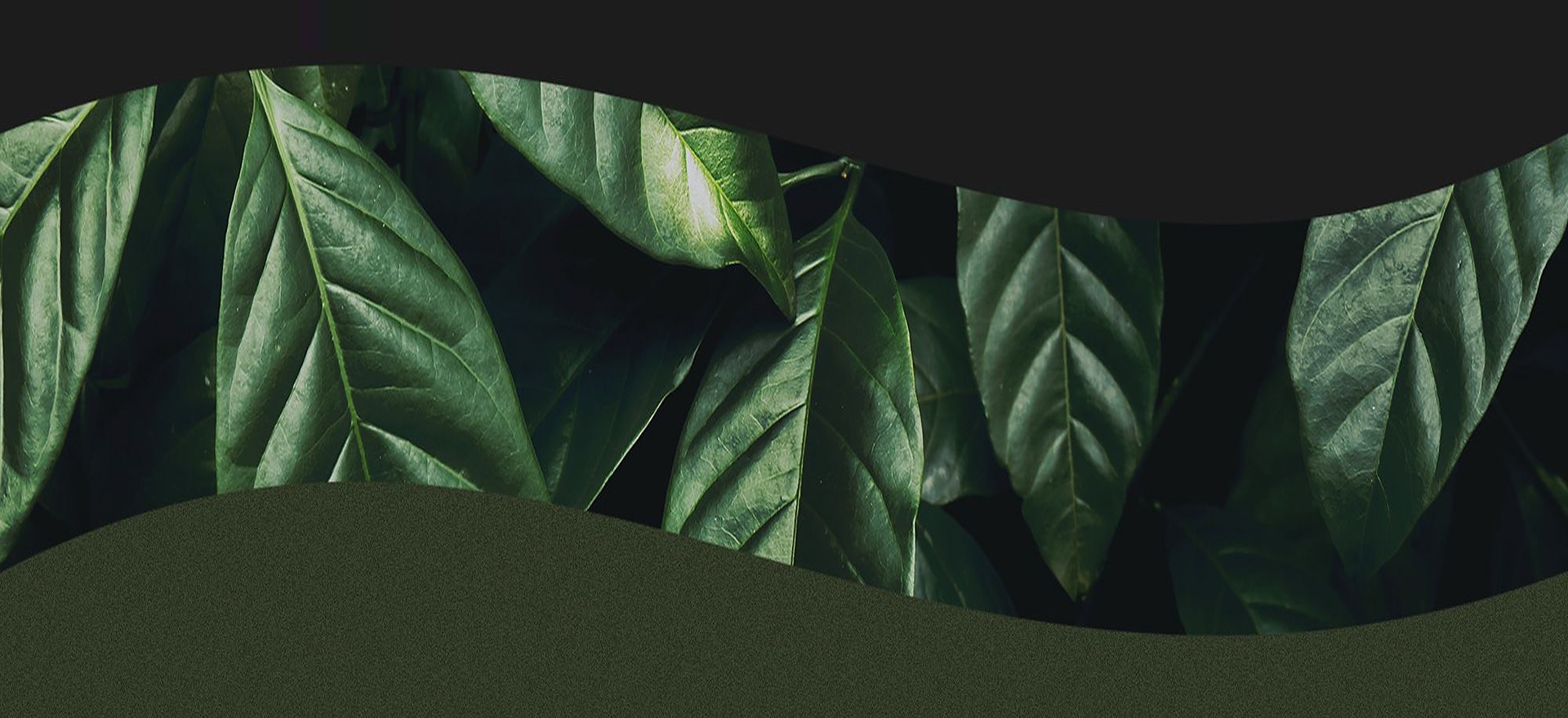
A distinct visual metaphor rooted in sea waves and tropical foliage without clichés.
Clean geometry that reproduces effortlessly via embossing, foil stamping, embroidery, and architectural signage.
Unified rules connecting stationery, room keycards, welcome kits, textiles, and digital communication.
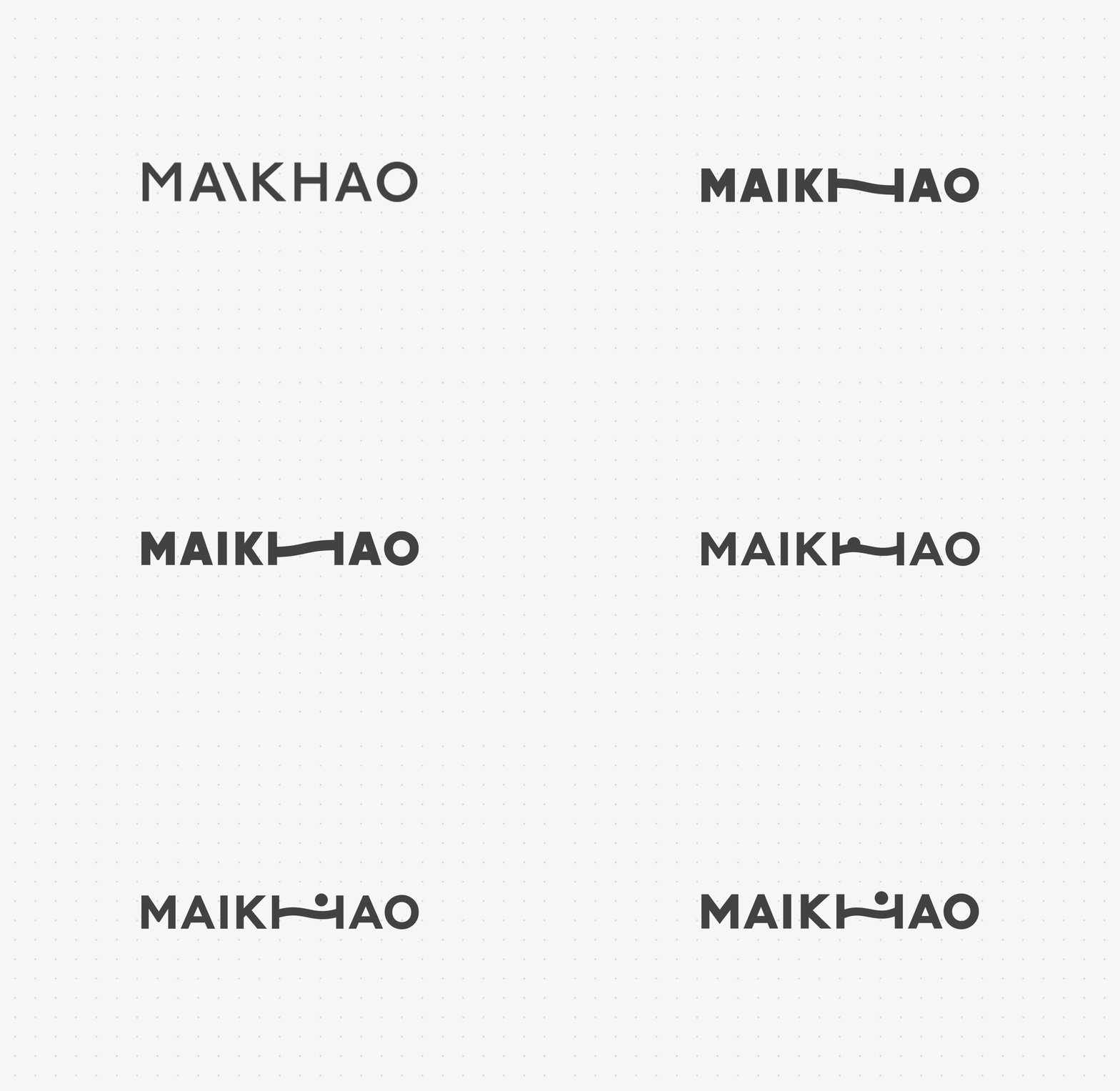
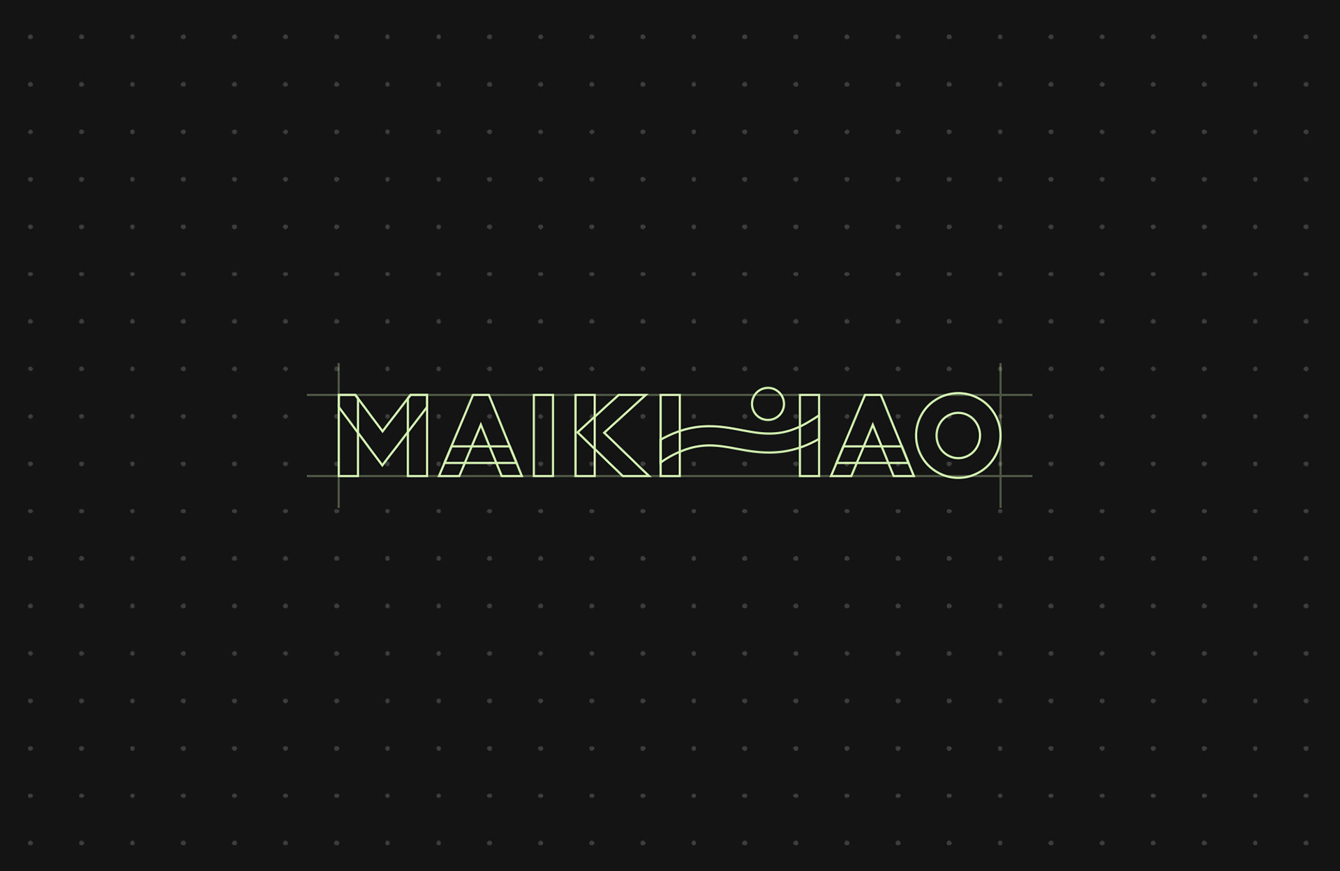
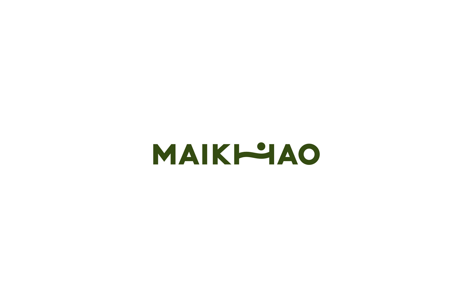
Wave monogram and balanced wordmark
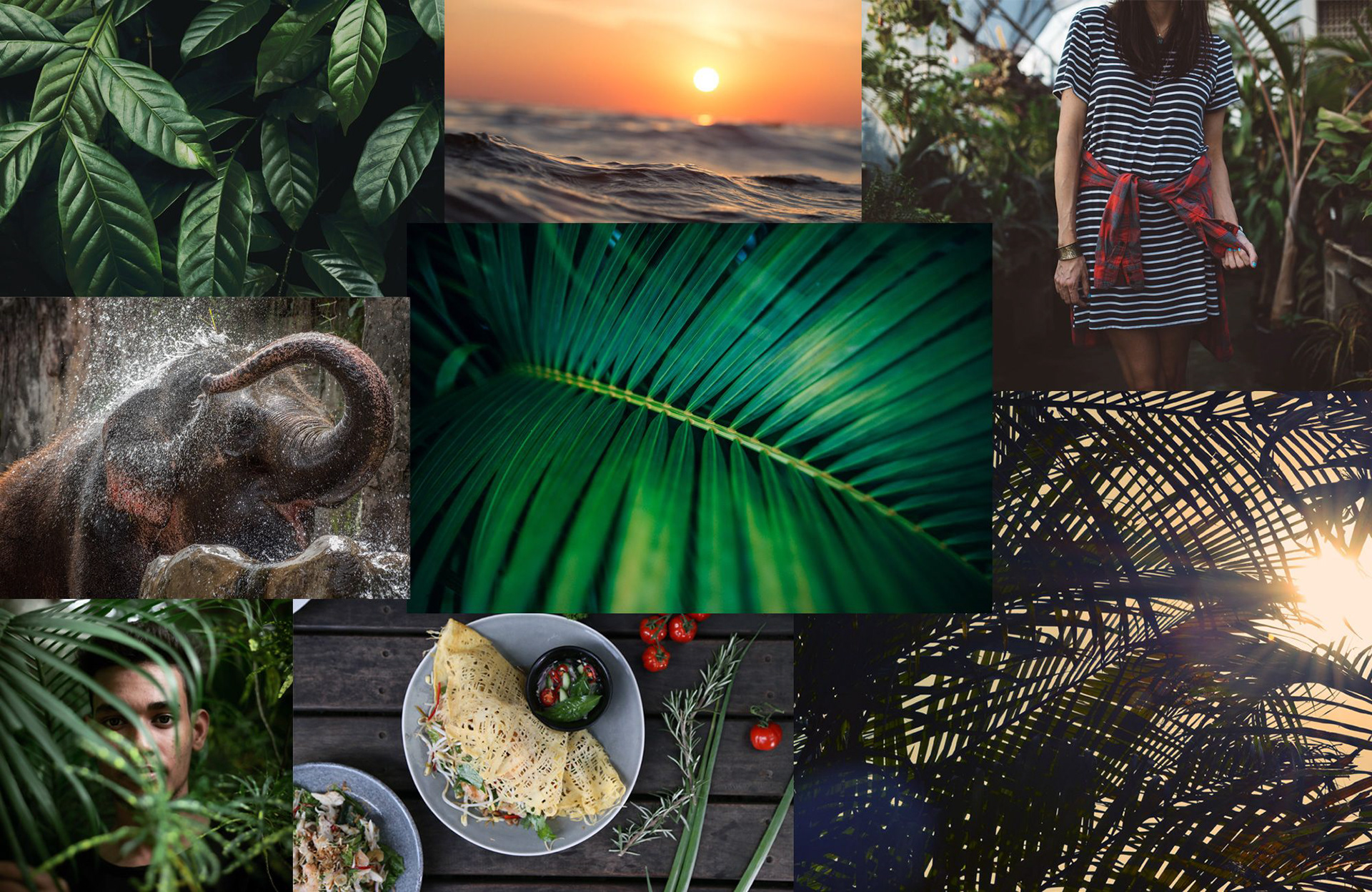
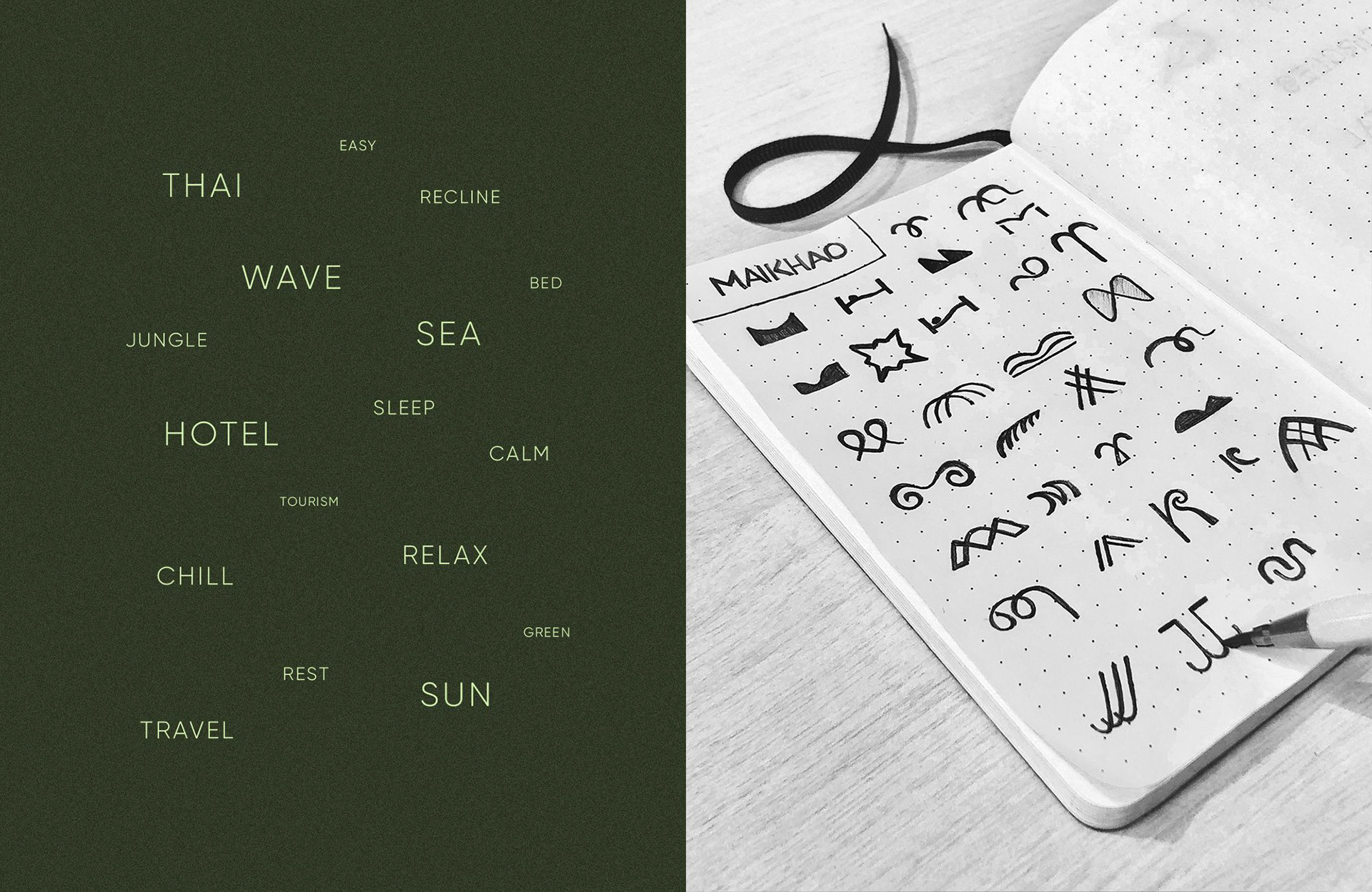
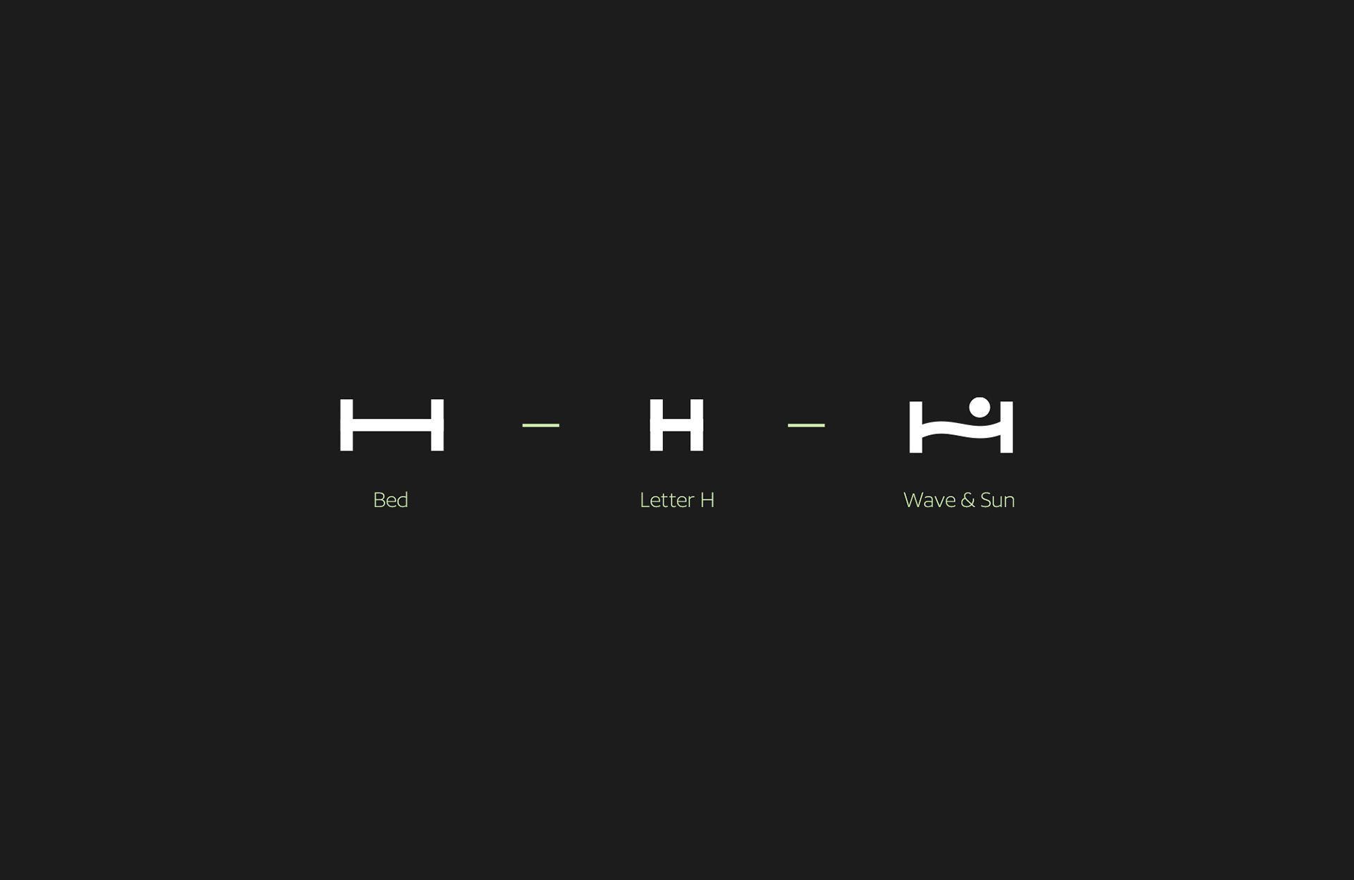
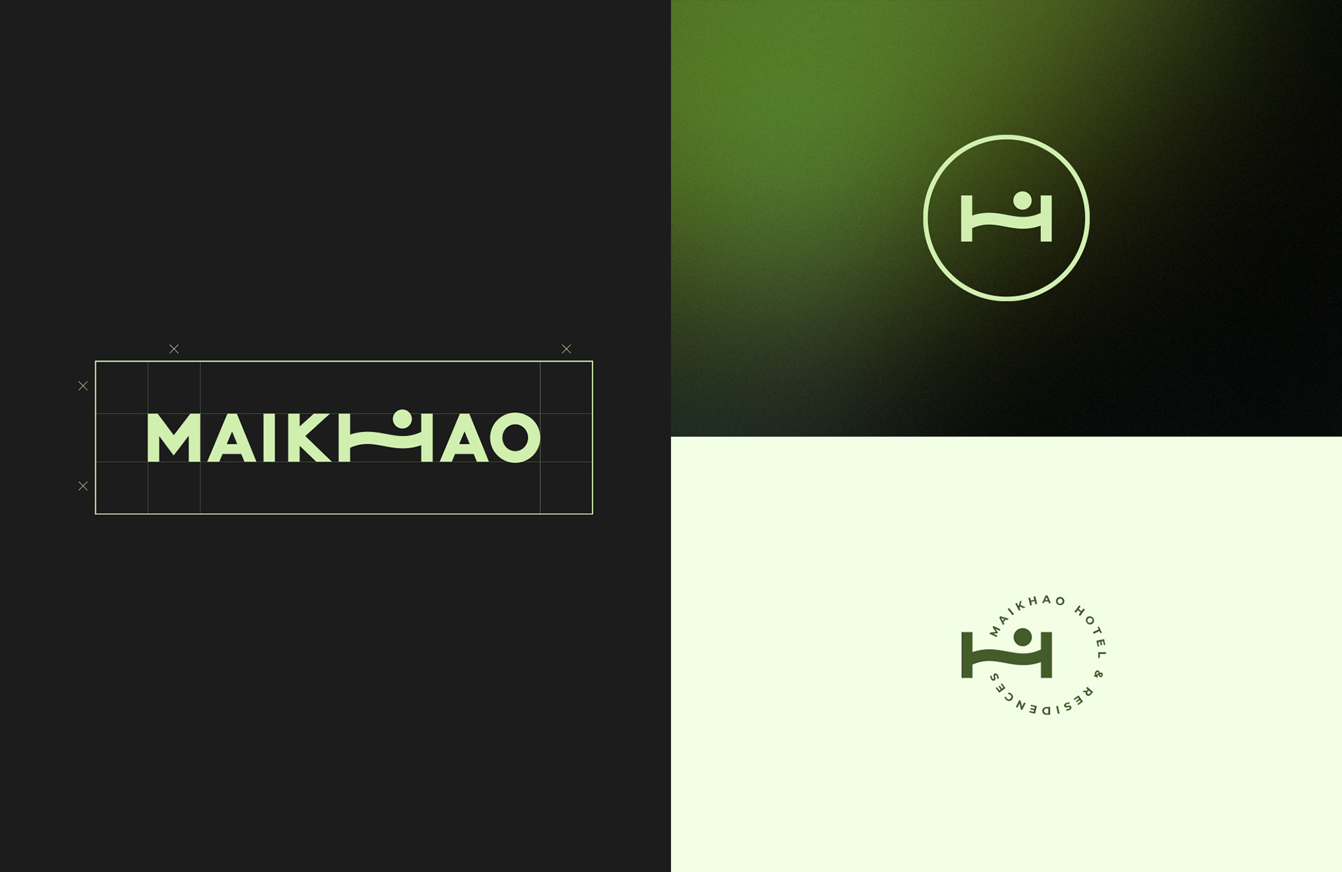
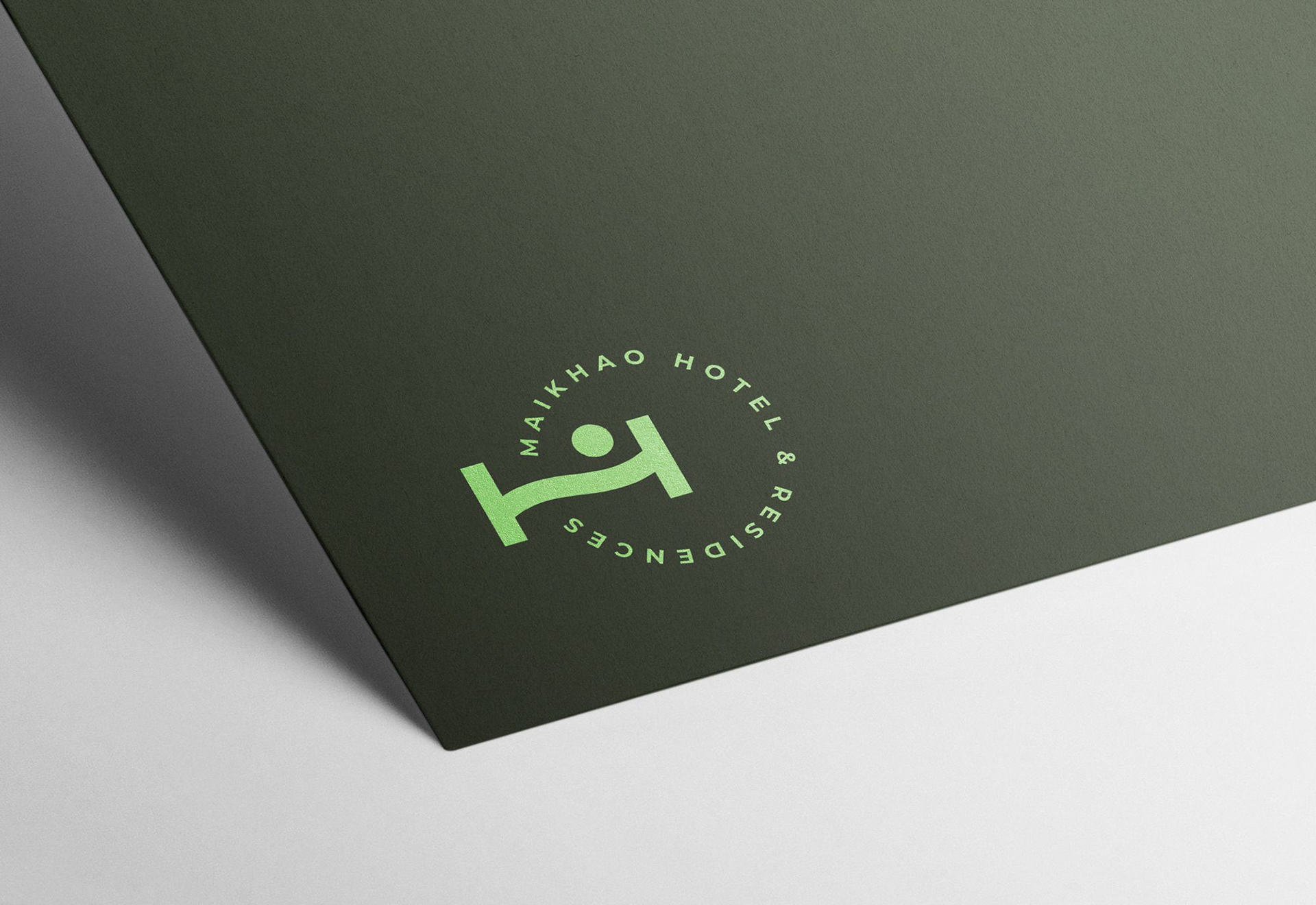
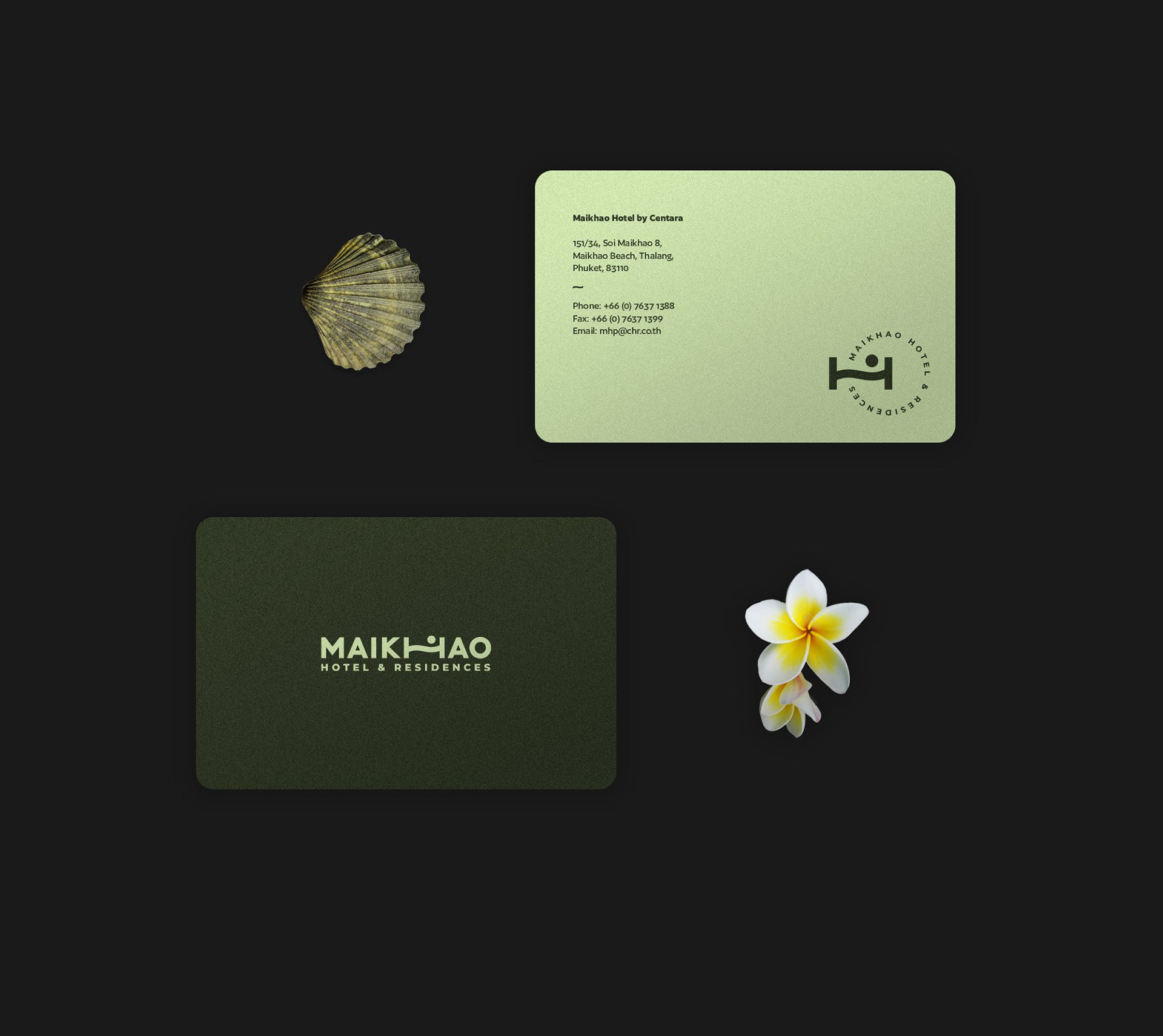
Born from coastal associations and hand-drawn sketches, the symbol merges the letter H with a reclining silhouette, sea wave, and sun — working both in horizontal lockups and circular emblems.
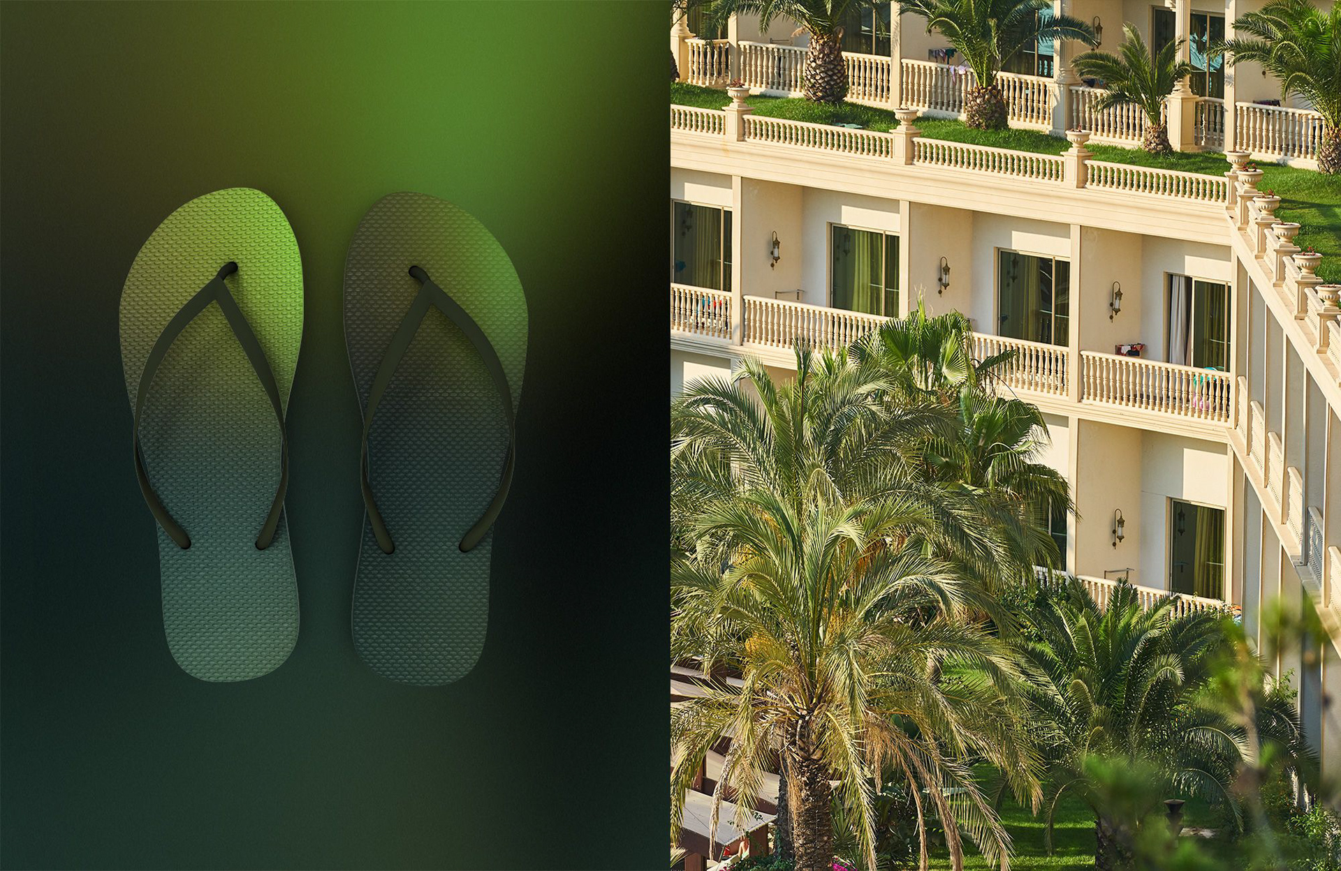
Natural tropical tones and calm typography
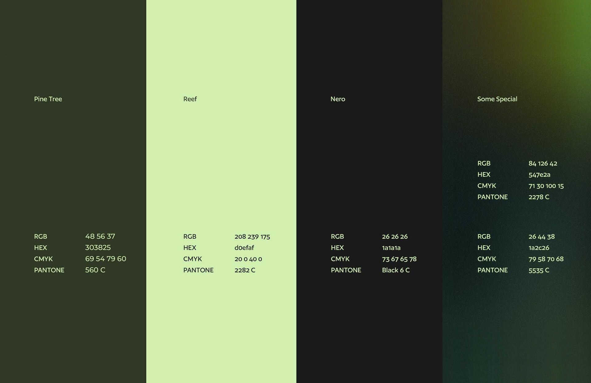
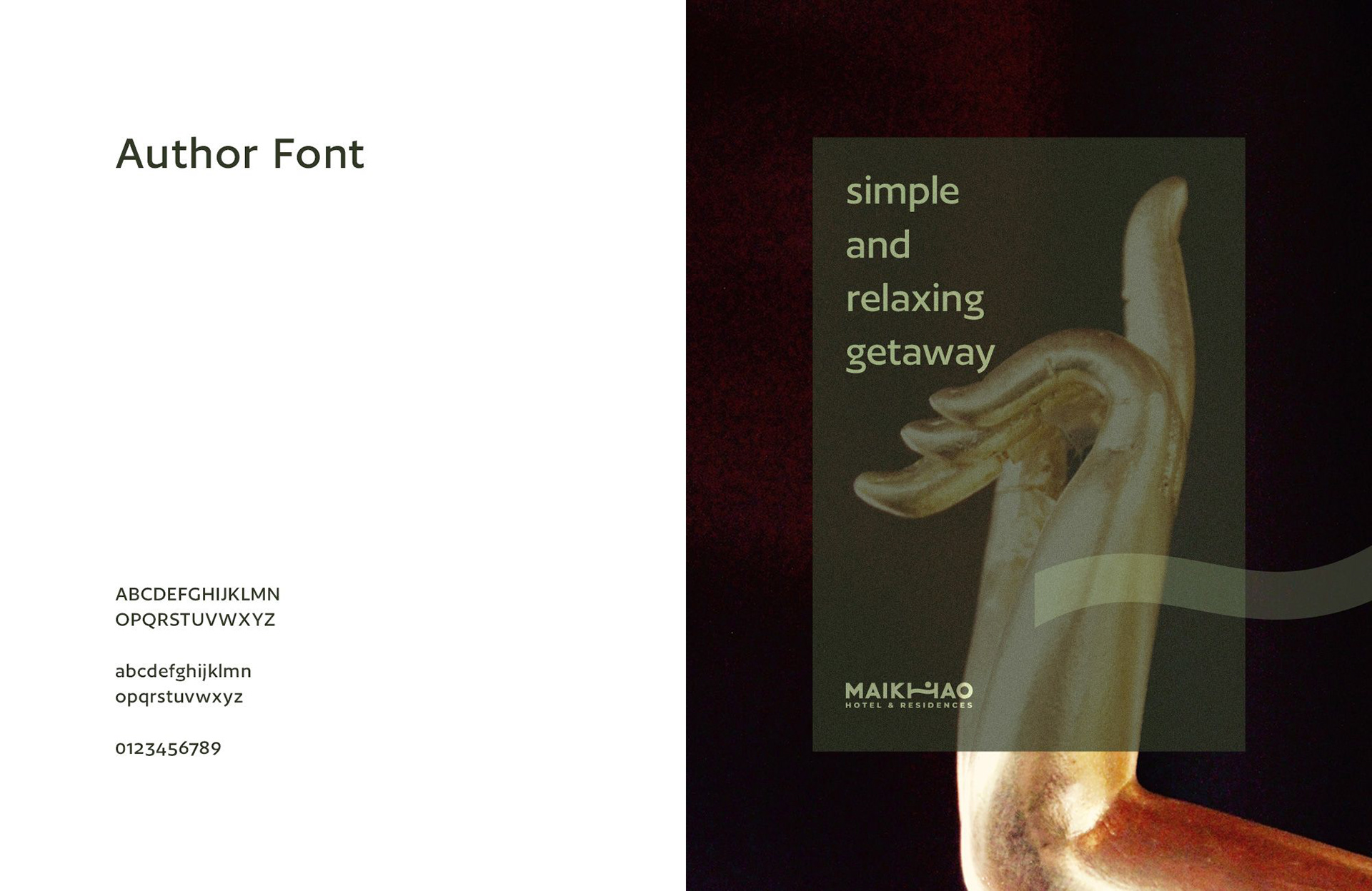
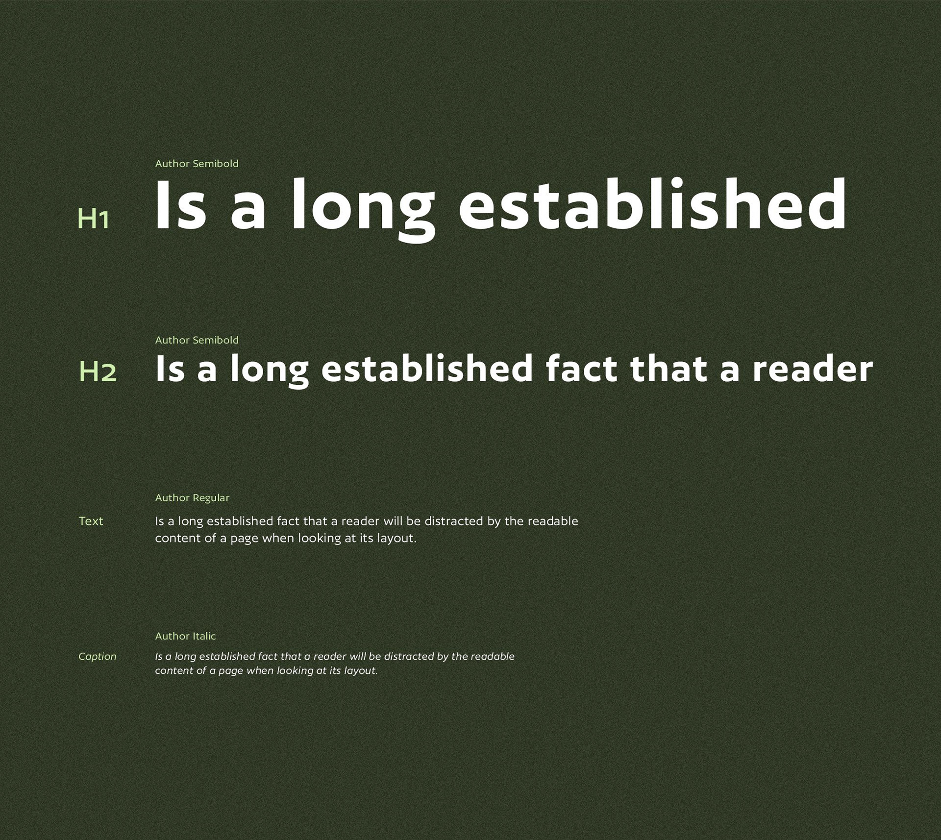
Pine Tree green, Reef lime, and Nero black paired with the Author typeface family create a calm, tactile sense of resort luxury across print and digital layouts.
Organic wave lines connect architecture and nature
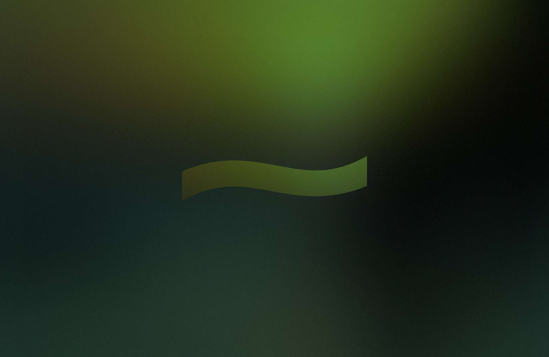
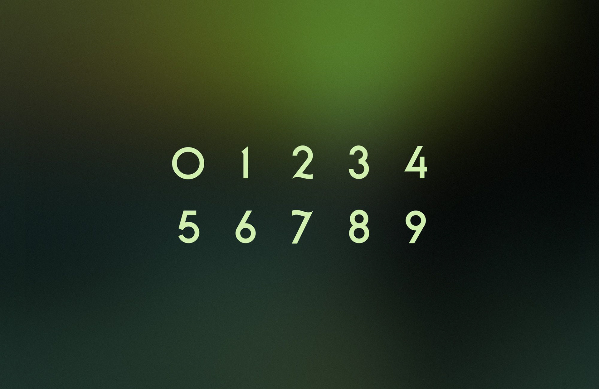
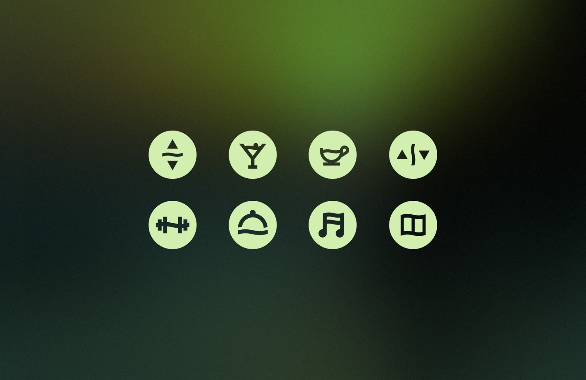
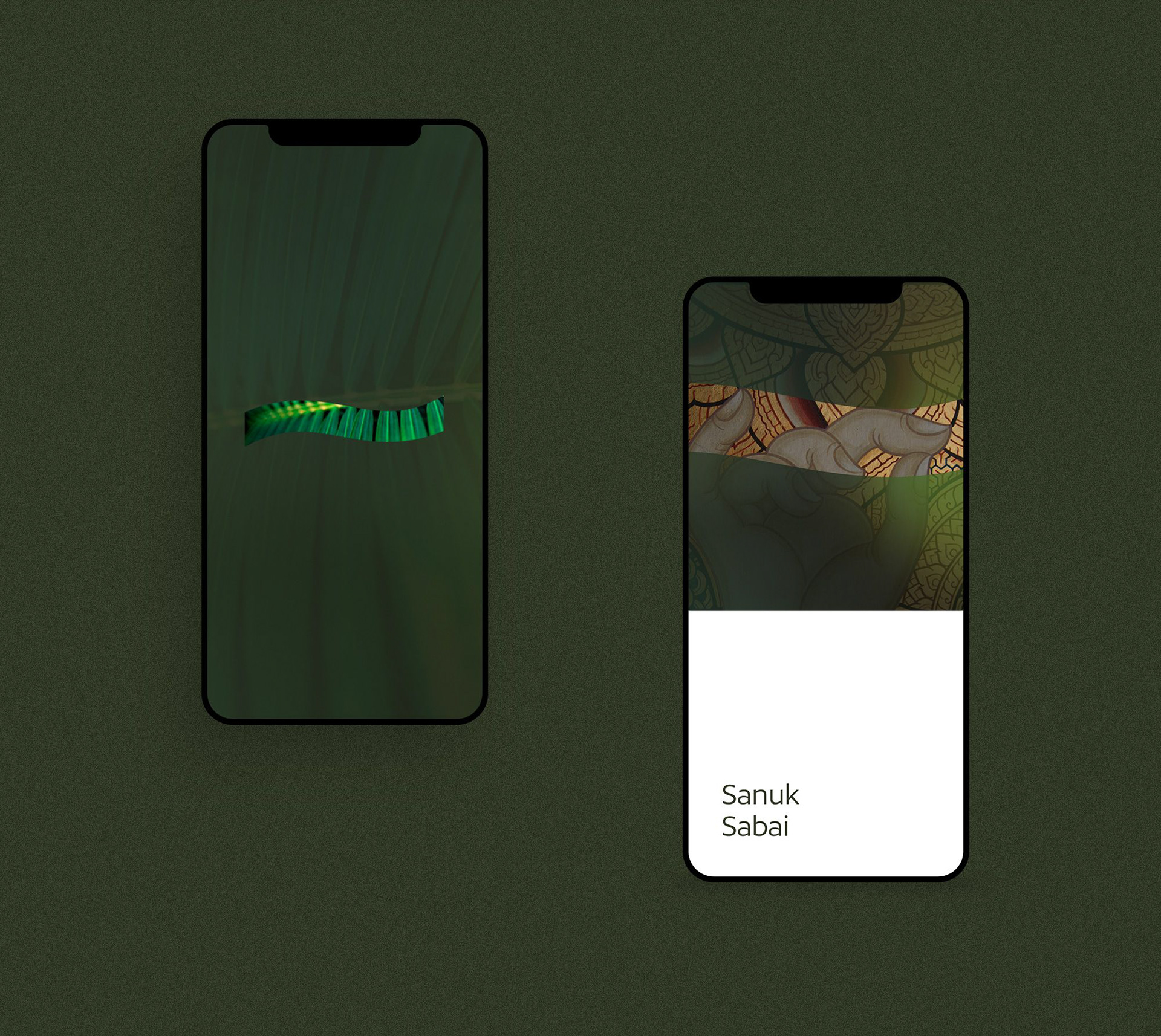
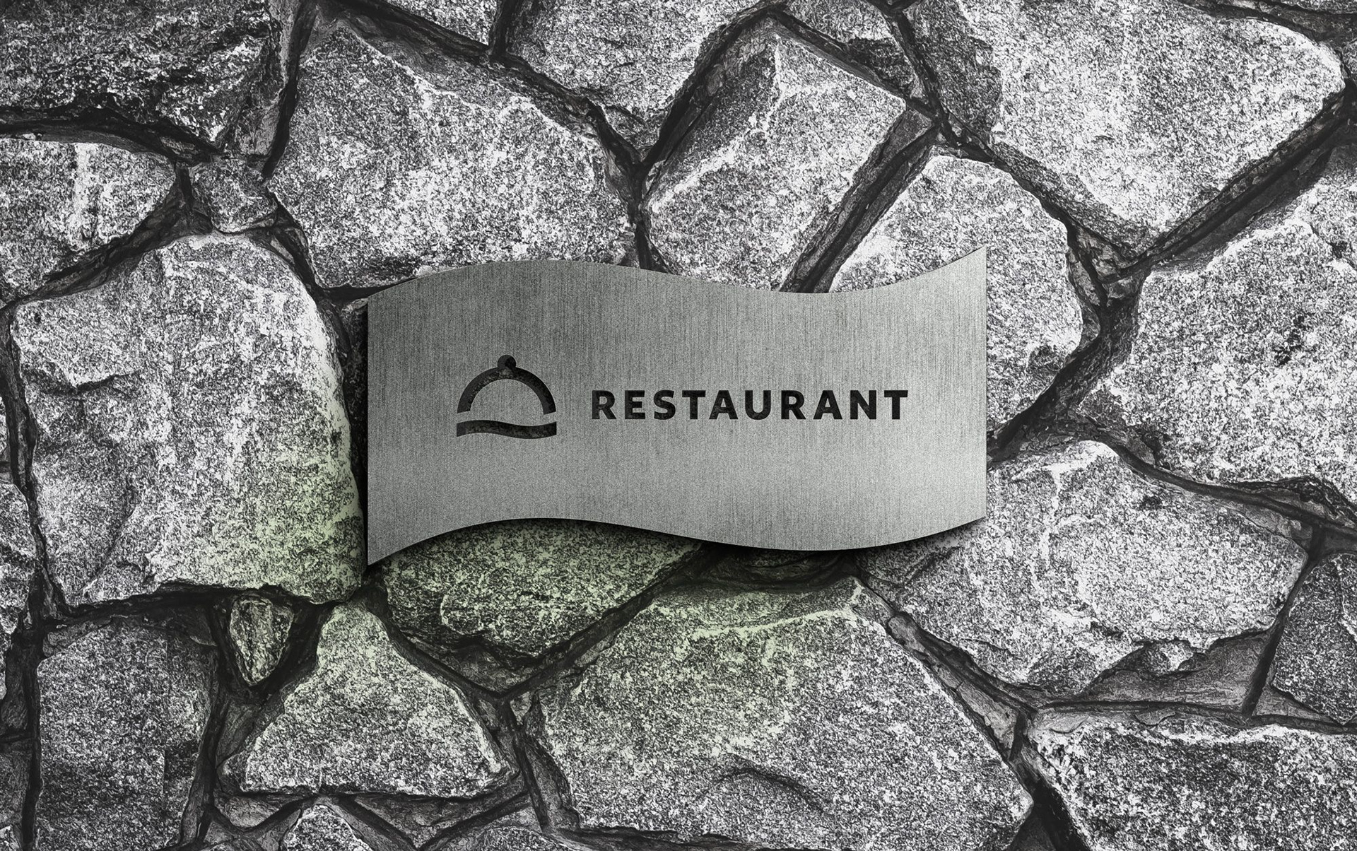
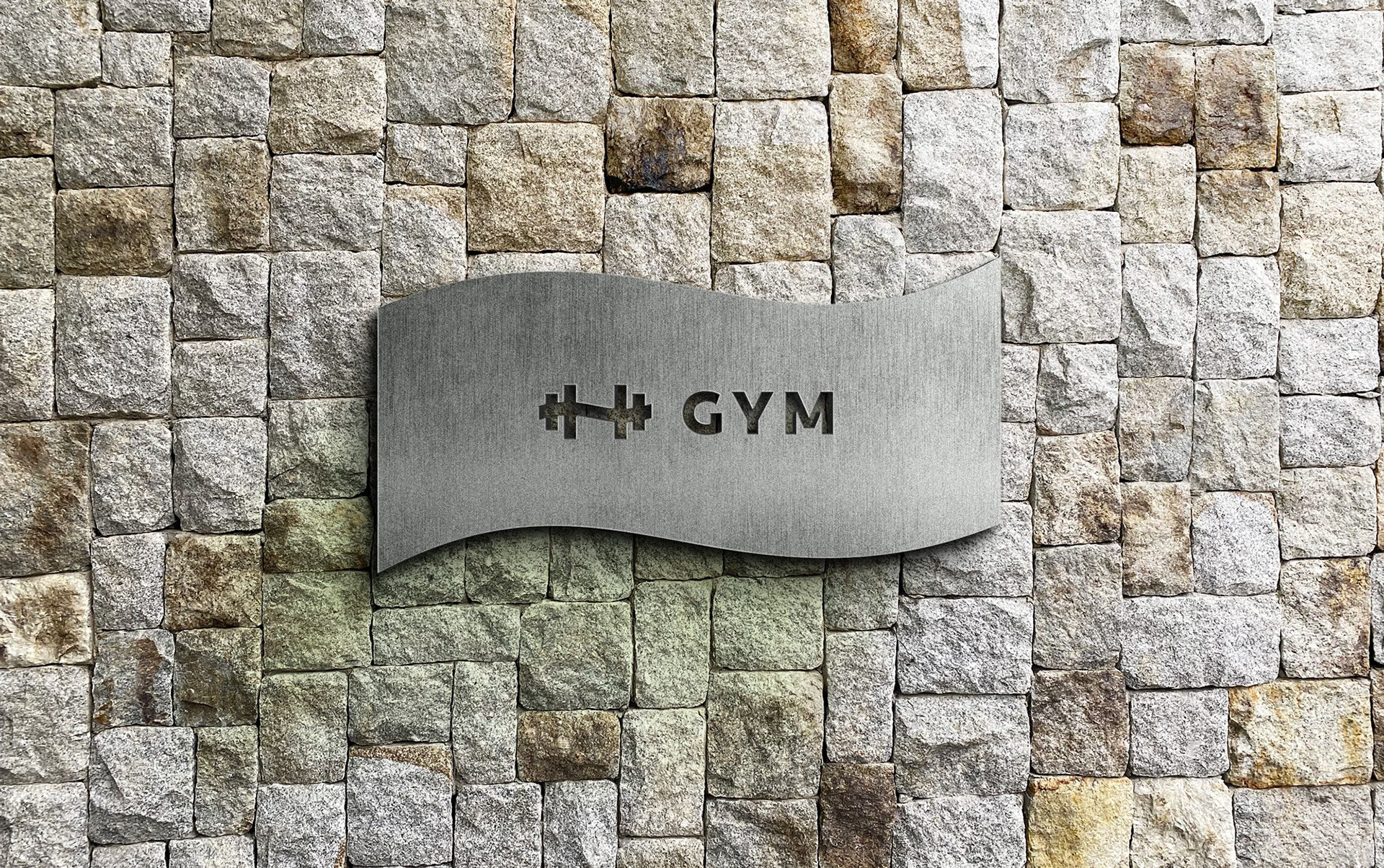
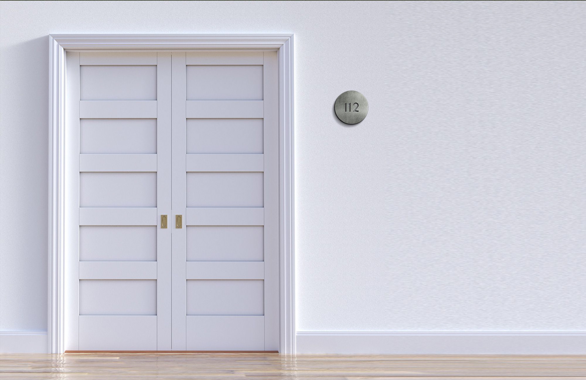
Taken directly from the monogram’s central wave, the flowing curve shapes photo containers, custom room numerals, and resort wayfinding icons.
Consistent across stationery, signage, and resort life
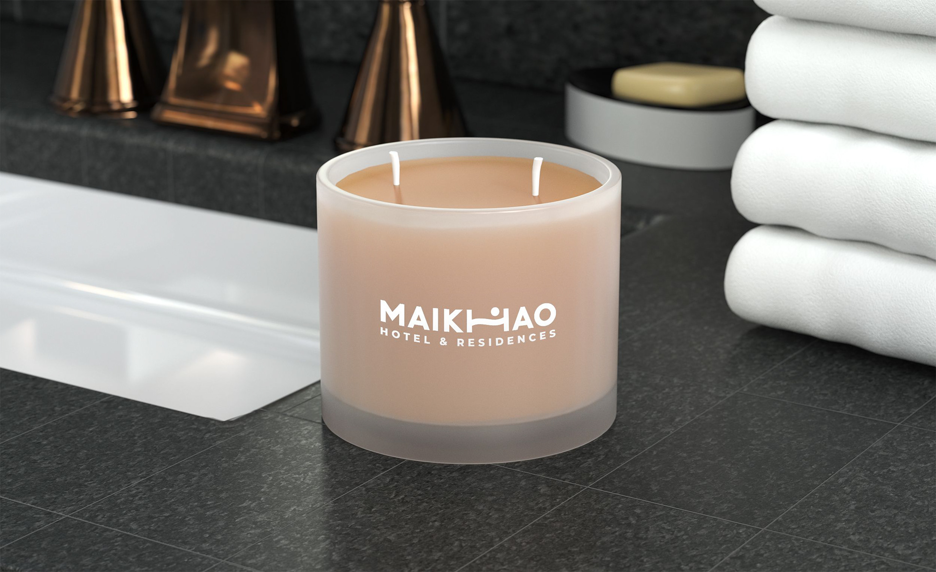
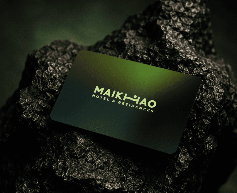
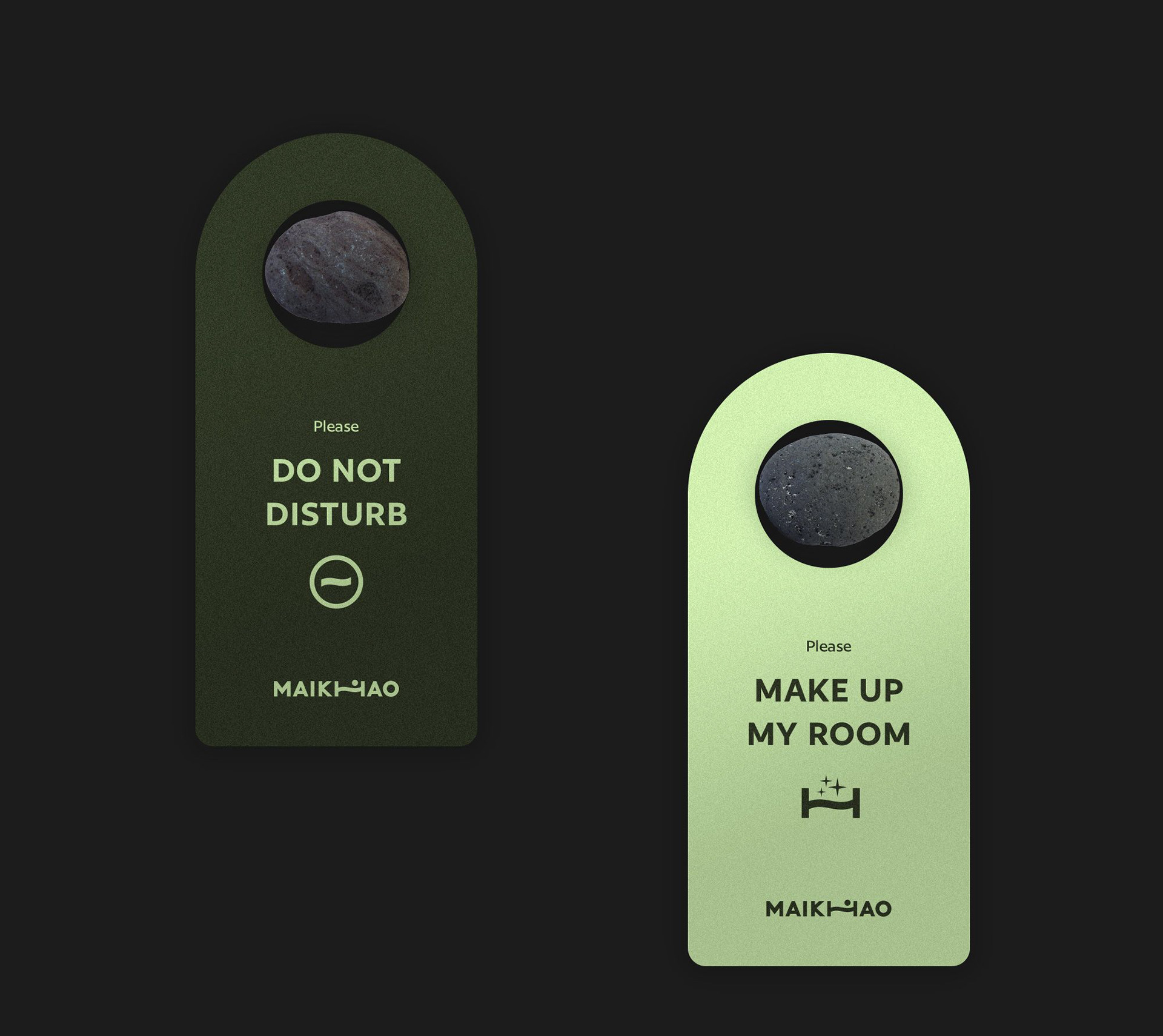
From room tags and keycards to stone-mounted wayfinding signage and guest amenities — every touchpoint carries the same calm coastal rhythm.
Need
a
logo
or
identity
system?
Start
with
a
short
message.
Send a few details about your project, current stage, timeline, and what you need. I'll reply with the next step or a few questions to clarify the scope.