Similaris
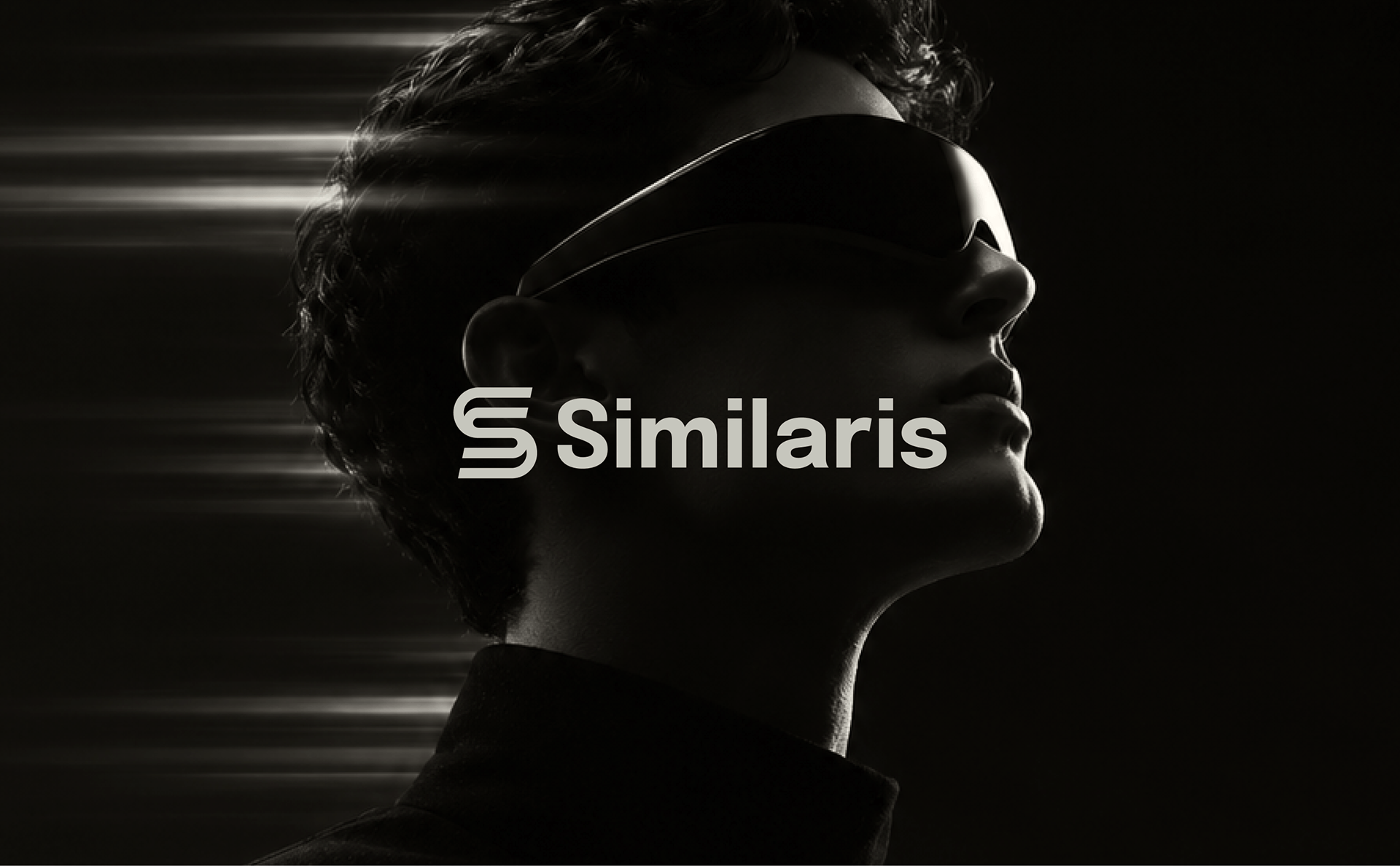
Identity system for a next-generation technology and digital platform built around unified motion, parallel trajectories, and modular clarity.
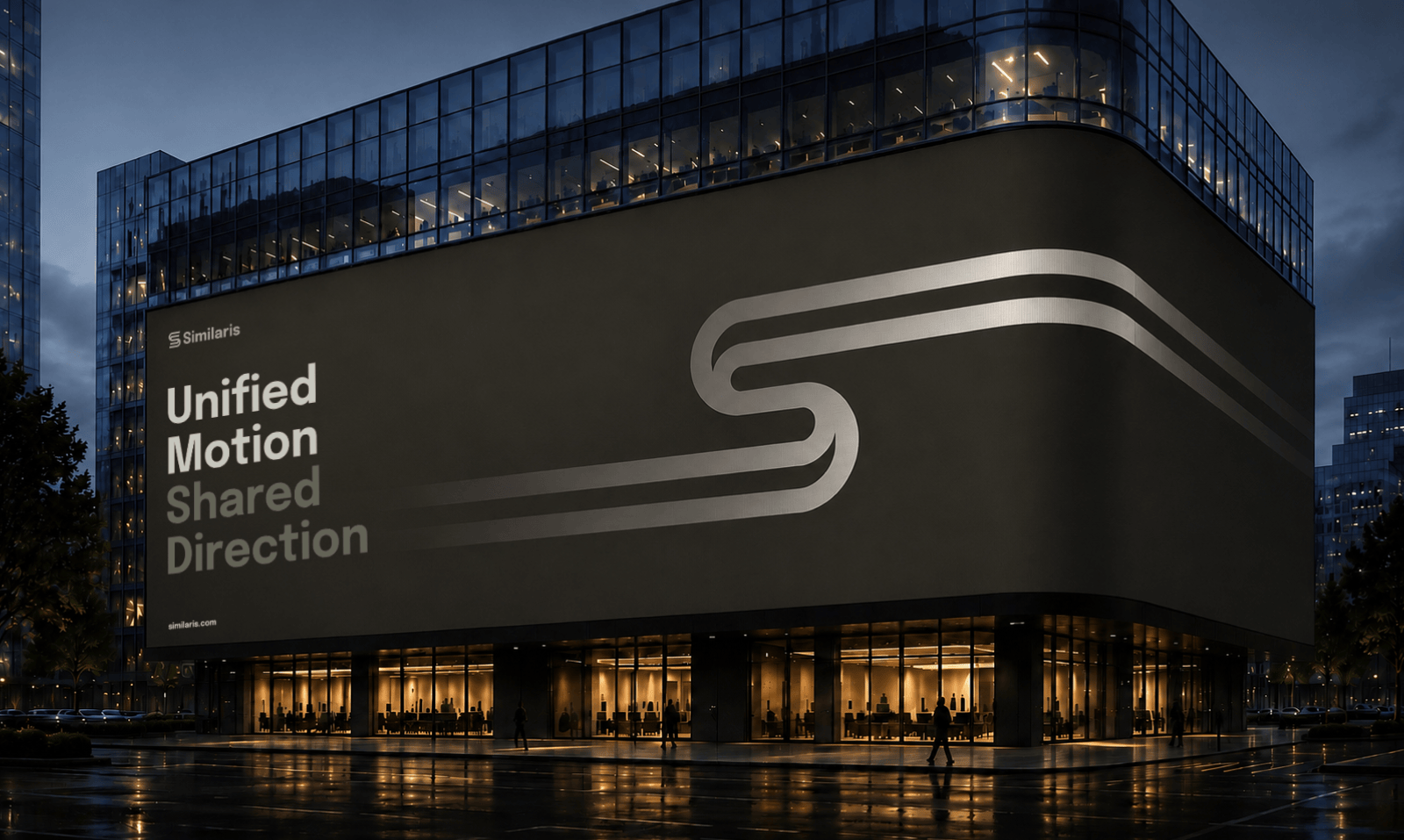
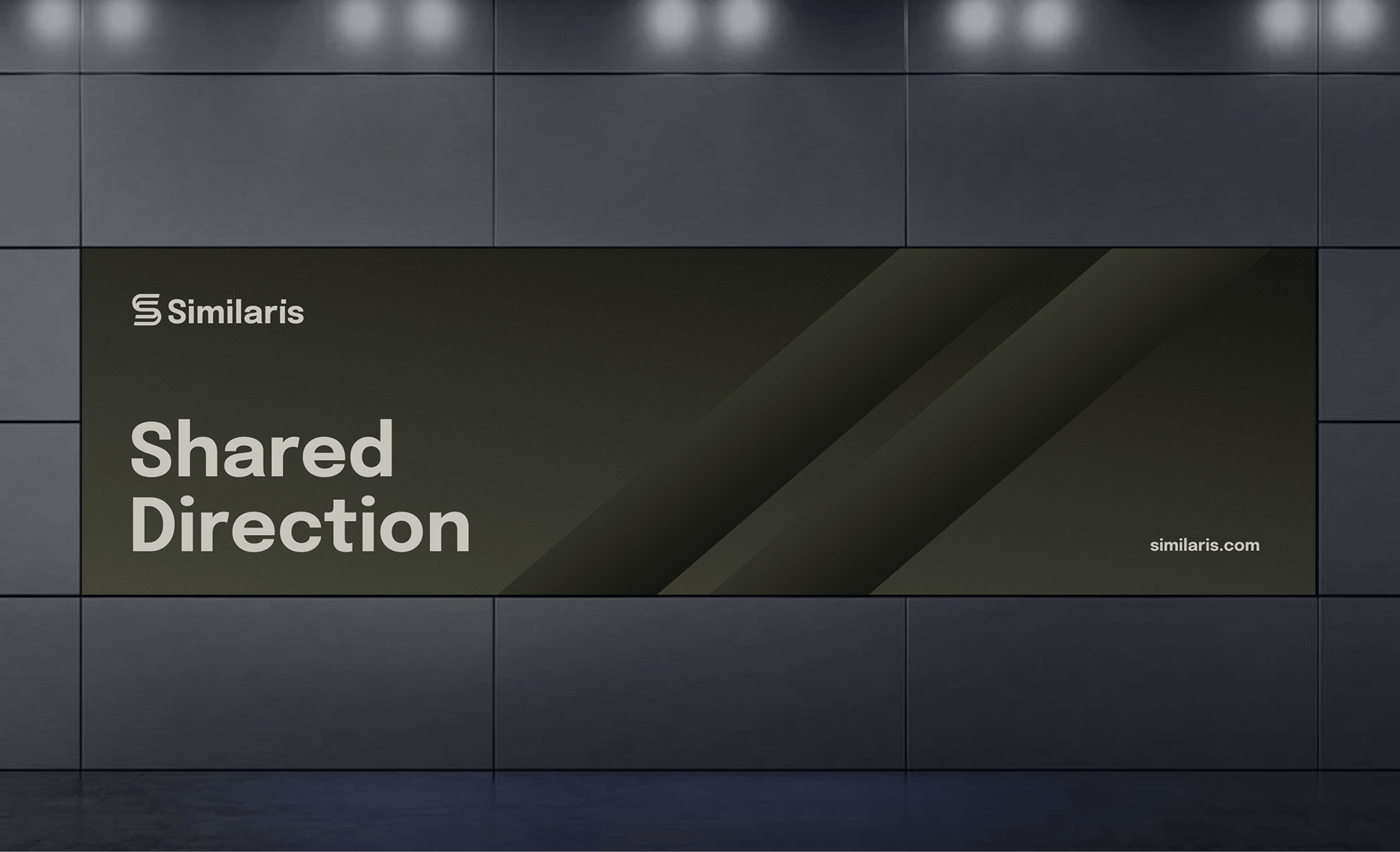
Unified motion and shared direction
Similaris connects parallel data streams and human intent into a unified digital experience. The brand needed an identity that conveys mathematical precision, continuous kinetic energy, and institutional authority across digital interfaces, spatial environments, and physical hardware.
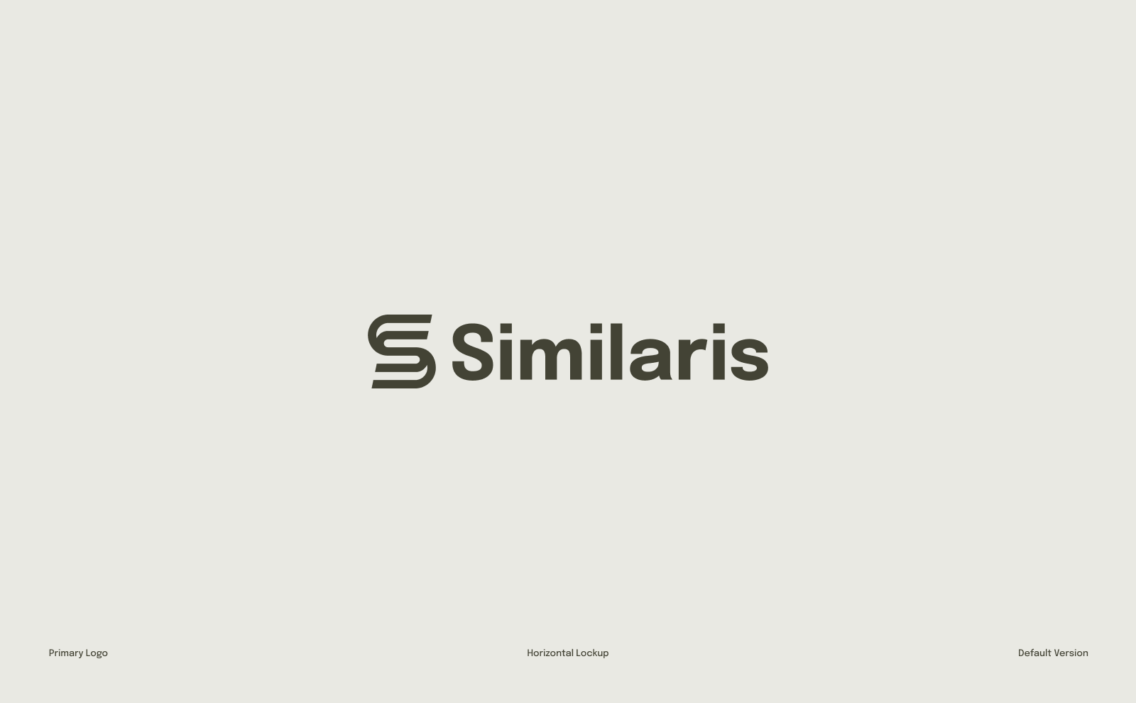
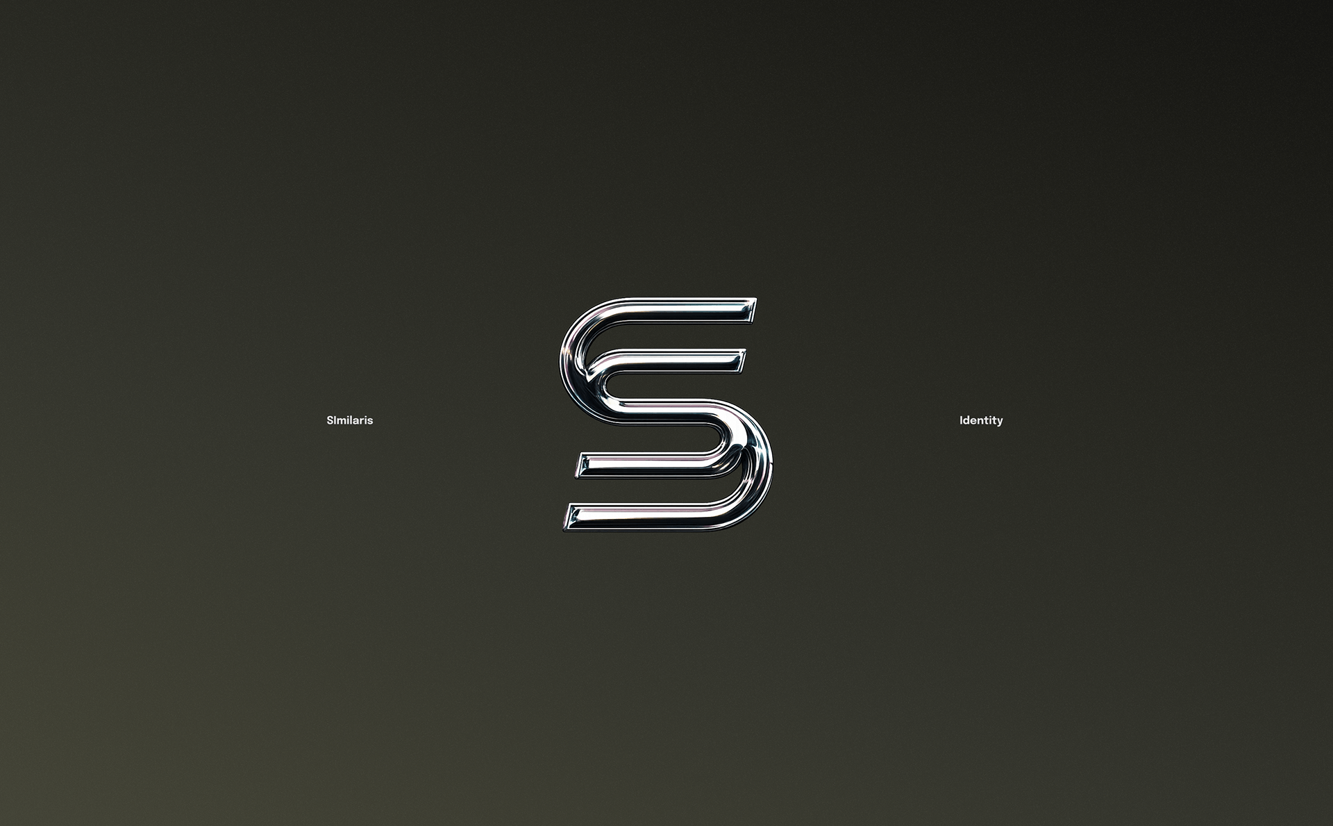
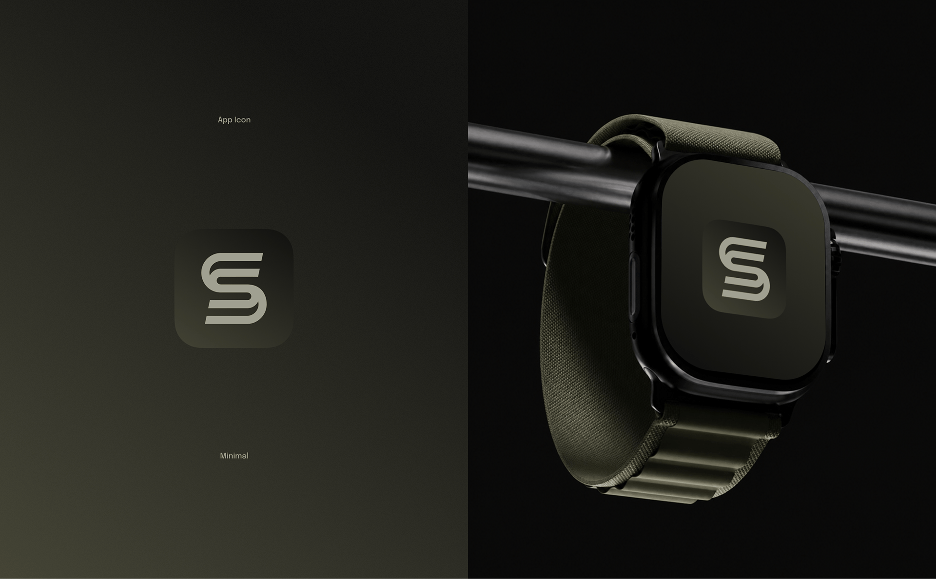
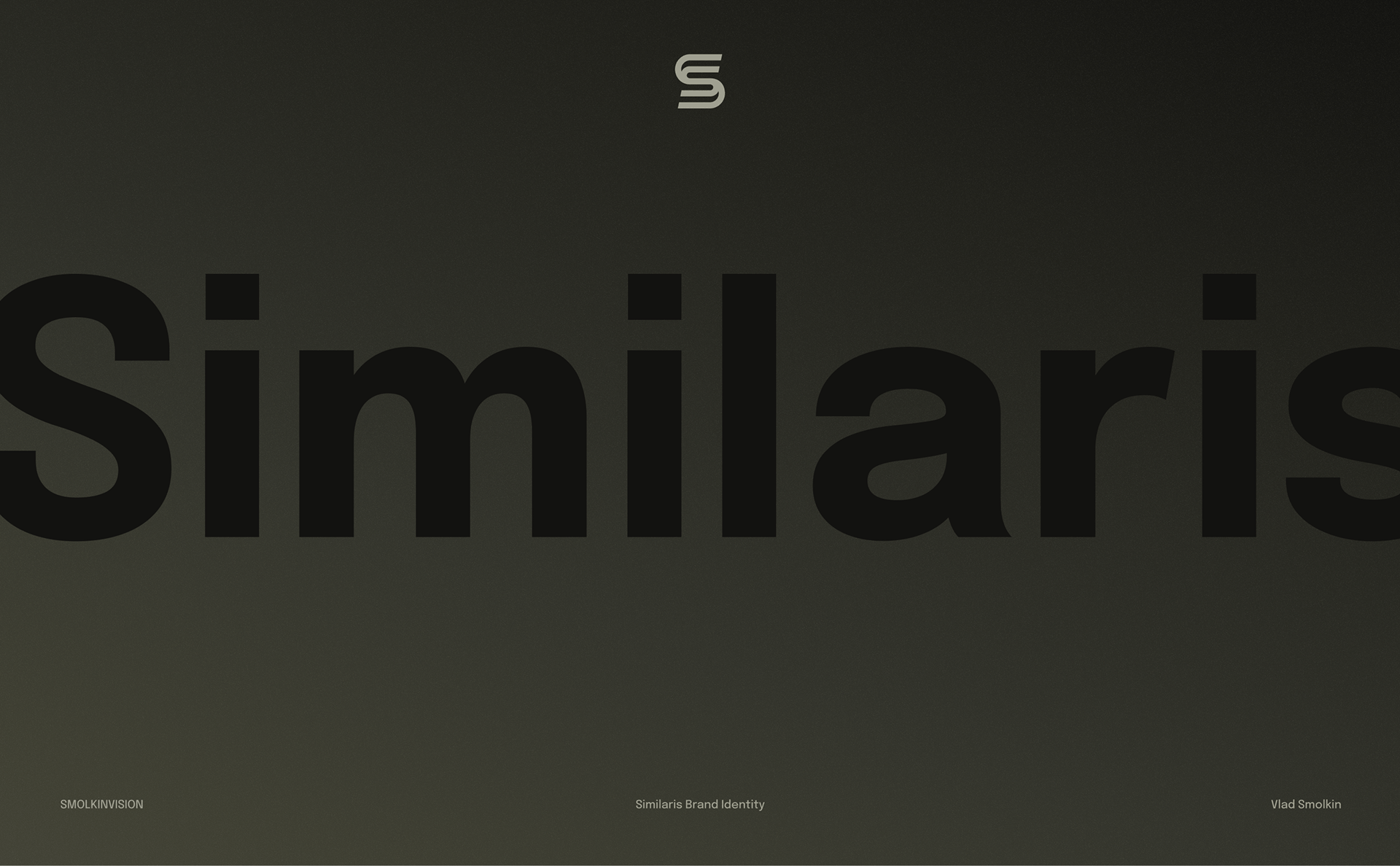
A continuous dual-stroke symbol that expresses parallel movement and alignment across compact digital icons.
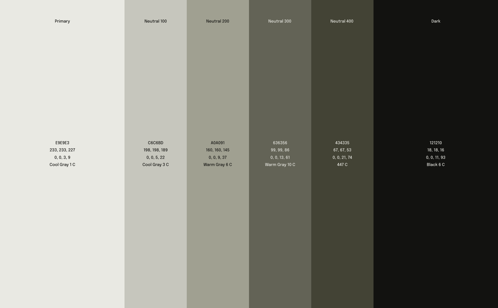
Muted olive, cement neutrals, and deep shadow tones creating a quiet, premium aesthetic distinct from loud tech clichés.
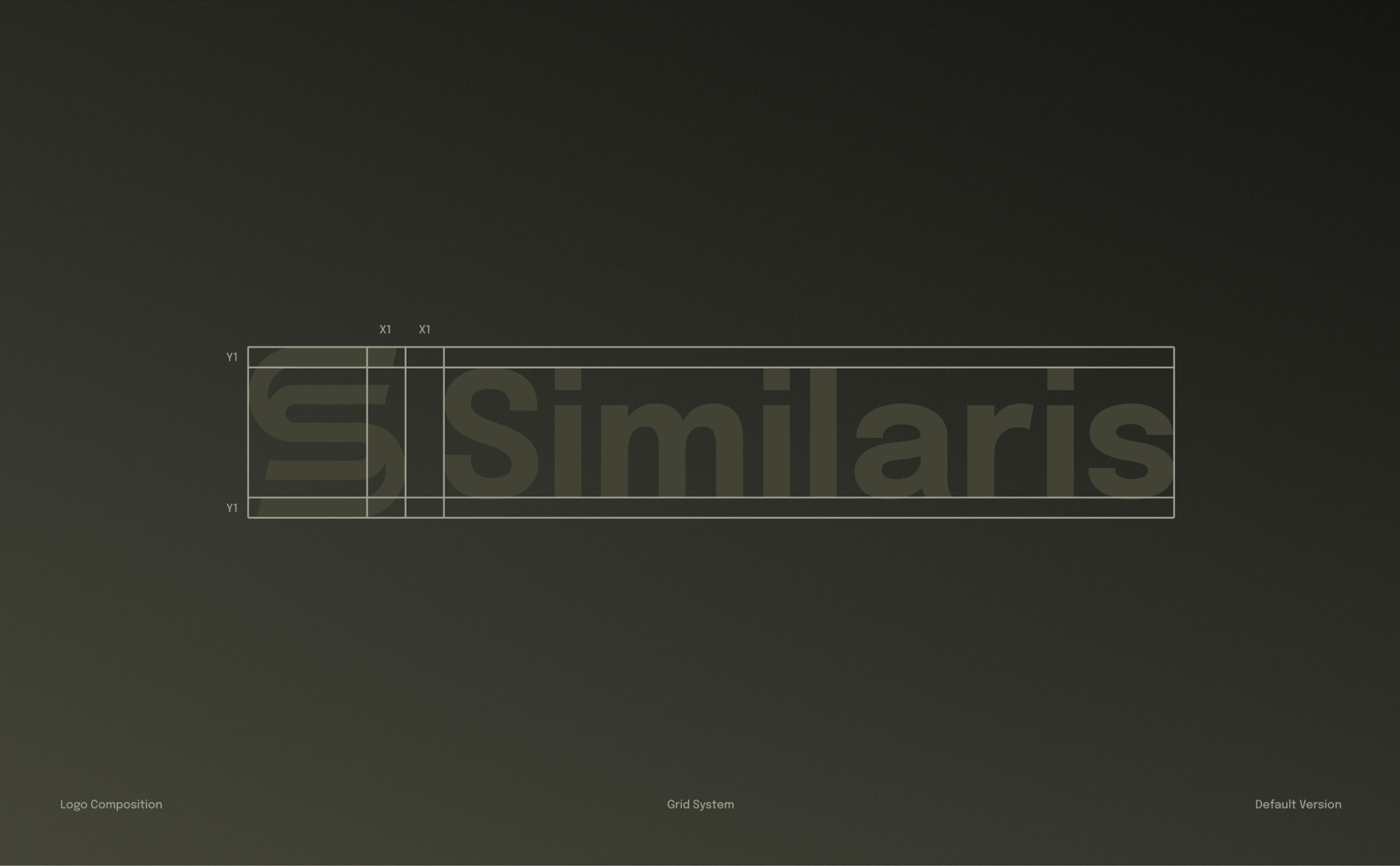
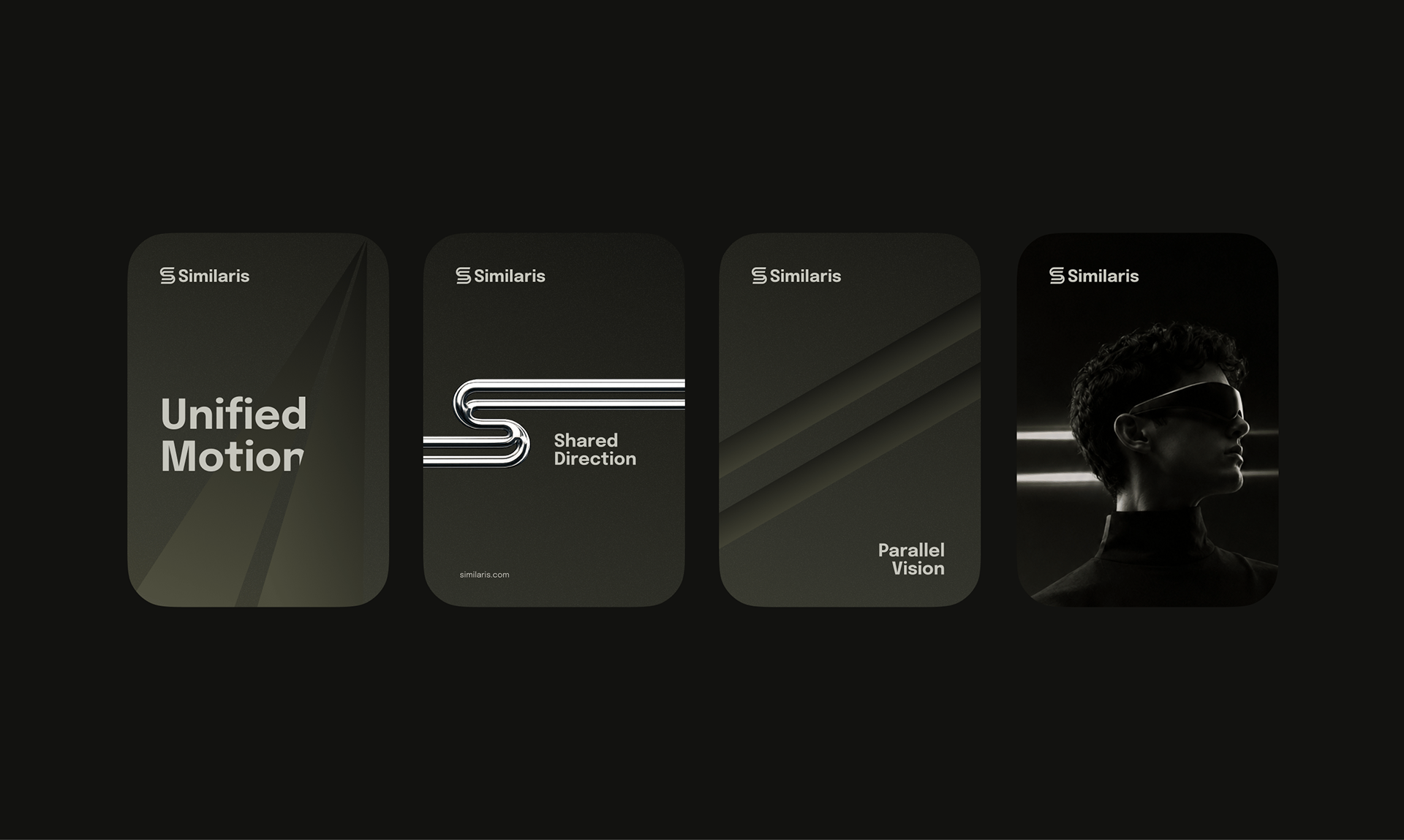
A graphic toolkit derived from parallel line geometry that structures dashboards, editorial guides, and spatial signage.
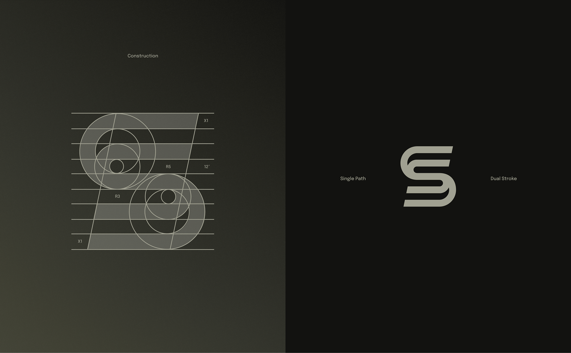
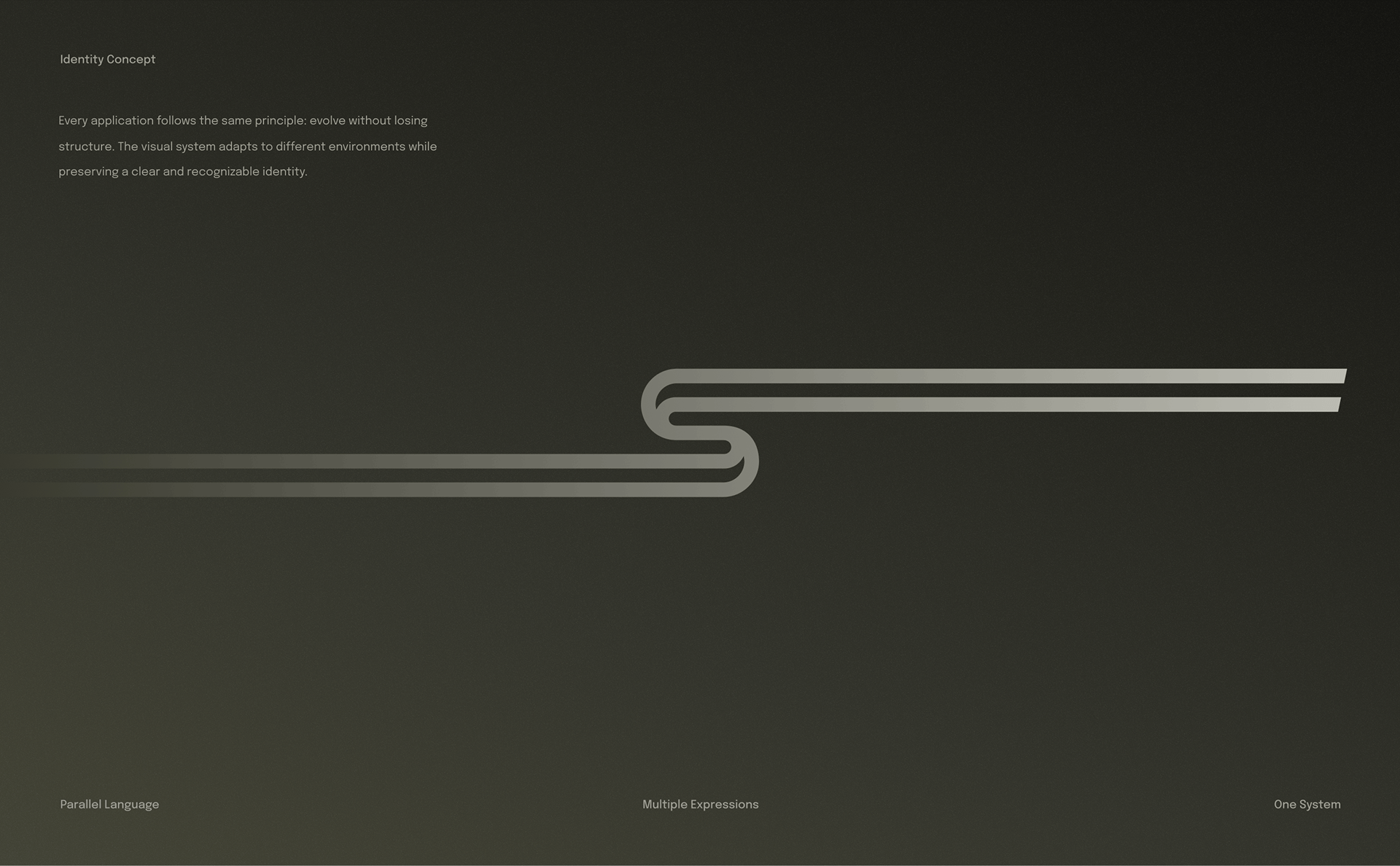
Single path geometry and dual-stroke rhythm
Built on a strict circular grid, the monogram transitions seamlessly from a single line vector into a dual-stroke parallel band, culminating in a liquid-chrome 3D emblem for tactile applications.
Epilogue typeface and tactile neutrals
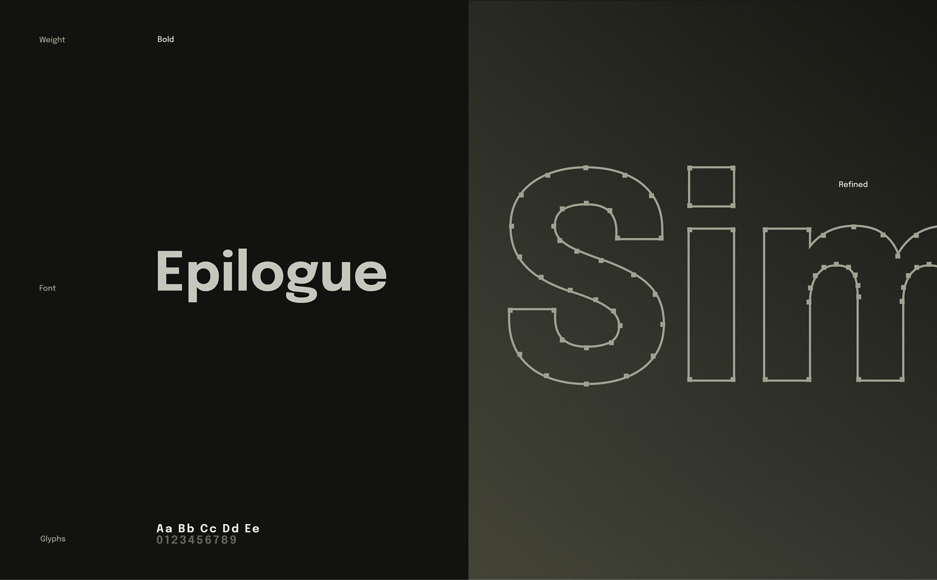
The Epilogue grotesque headline family pairs with a graduated spectrum of warm grey, olive neutral, and inky dark tones for editorial and interface hierarchy.
Parallel lines unite wearables and interfaces
The parallel stroke language scales fluidly from micro smartwatch displays and app icons to full-screen motion graphics and digital editorial covers.
Applied across hardware, spaces, and touchpoints
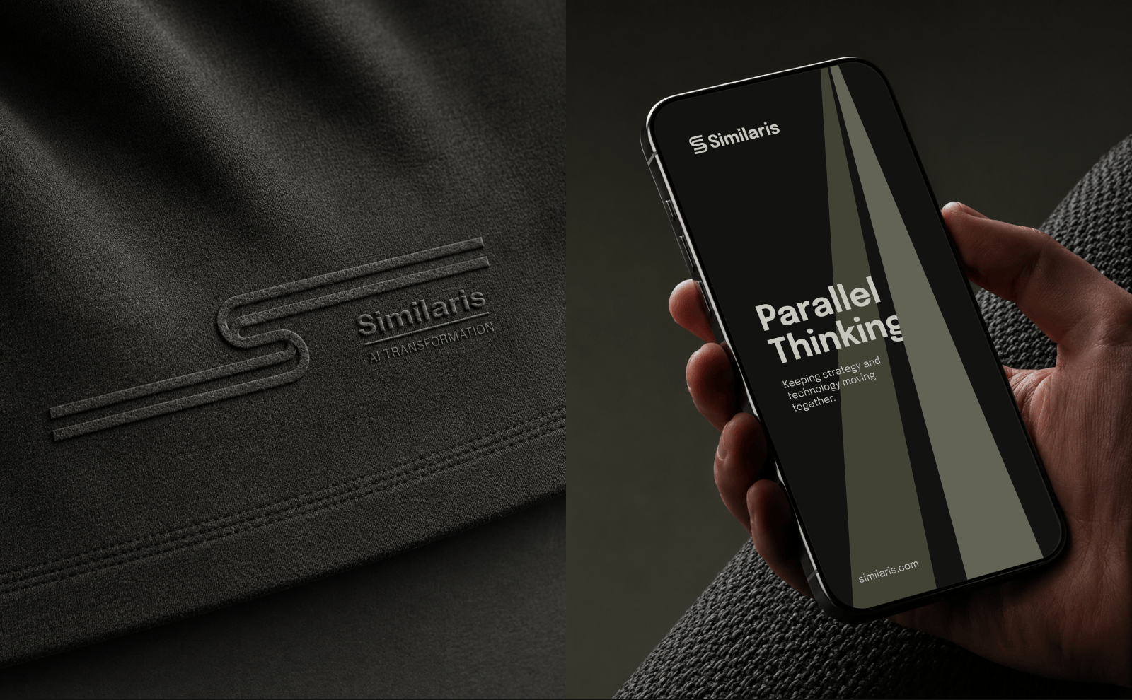
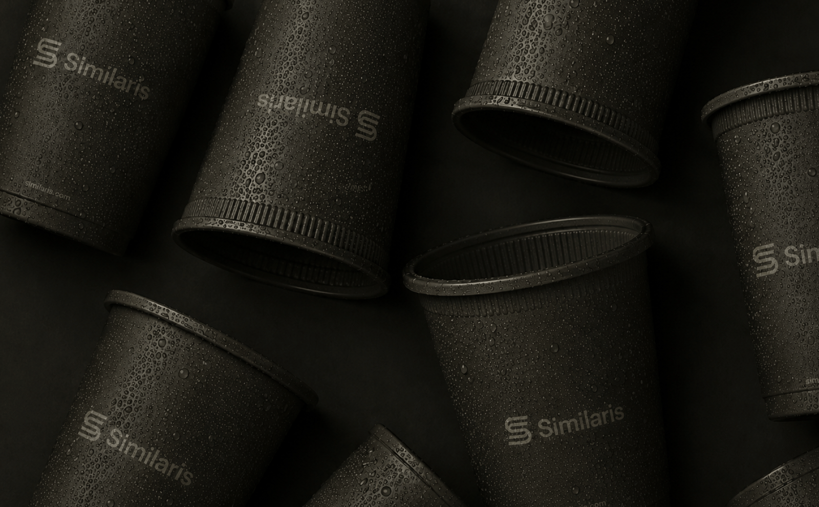
From kinetic light installations and architectural banners to smartphone interfaces, debossed apparel, and coffee goods — the identity maintains quiet, technological elegance.

Need
a
logo
or
identity
system?
Start
with
a
short
message.
Send a few details about your project, current stage, timeline, and what you need. I'll reply with the next step or a few questions to clarify the scope.